
|
|
|
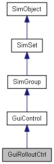
A container that shows a single child with an optional header bar that can be used to collapse and expand the rollout. More...

Public Member Functions | |
| void | collapse () |
| Collapse the rollout if it is currently expanded. This will make the rollout's child control invisible. | |
| void | expand () |
| Expand the rollout if it is currently collapsed. This will make the rollout's child control visible. | |
| void | instantCollapse () |
| Instantly collapse the rollout without animation. To smoothly slide the rollout to collapsed state, use collapse(). | |
| void | instantExpand () |
| Instantly expand the rollout without animation. To smoothly slide the rollout to expanded state, use expand(). | |
| bool | isExpanded () |
| Determine whether the rollout is currently expanded, i.e. whether the child control is visible. | |
| void | sizeToContents () |
| Resize the rollout to exactly fit around its child control. This can be used to manually trigger a recomputation of the rollout size. | |
| void | toggleCollapse () |
| Toggle the current collapse state of the rollout. If it is currently expanded, then collapse it. If it is currently collapsed, then expand it. | |
| void | toggleExpanded (bool instantly=false) |
| Toggle the current expansion state of the rollout If it is currently expanded, then collapse it. If it is currently collapsed, then expand it. | |
Callbacks | |
| void | onCollapsed () |
| Called when the rollout is collapsed. | |
| void | onExpanded () |
| Called when the rollout is expanded. | |
| void | onHeaderRightClick () |
| Called when the user right-clicks on the rollout's header. This is useful for implementing context menus for rollouts. | |
Public Attributes | |
Rollout | |
| bool | autoCollapseSiblings |
| Whether to automatically collapse sibling rollouts. | |
| string | caption |
| Text label to display on the rollout header. | |
| bool | clickCollapse |
| Whether the rollout can be collapsed by clicking its header. | |
| int | defaultHeight |
| Default height of the client area. This is used when no child control has been added to the rollout. | |
| bool | expanded |
| The current rollout expansion state. | |
| bool | hideHeader |
| Whether to render the rollout header. | |
| RectI | margin |
| Margin to put around child control. | |
A container that shows a single child with an optional header bar that can be used to collapse and expand the rollout.
A rollout is a container that can be collapsed and expanded using smooth animation. By default, rollouts will display a header with a caption along the top edge of the control which can be clicked by the user to toggle the collapse state of the rollout.
Rollouts will automatically size themselves to exactly fit around their child control. They will also automatically position their child control in their upper left corner below the header (if present).
| void GuiRolloutCtrl::collapse | ( | ) |
Collapse the rollout if it is currently expanded. This will make the rollout's child control invisible.
| void GuiRolloutCtrl::expand | ( | ) |
Expand the rollout if it is currently collapsed. This will make the rollout's child control visible.
| void GuiRolloutCtrl::instantCollapse | ( | ) |
Instantly collapse the rollout without animation. To smoothly slide the rollout to collapsed state, use collapse().
| void GuiRolloutCtrl::instantExpand | ( | ) |
Instantly expand the rollout without animation. To smoothly slide the rollout to expanded state, use expand().
| bool GuiRolloutCtrl::isExpanded | ( | ) |
Determine whether the rollout is currently expanded, i.e. whether the child control is visible.
Reimplemented from SimObject.
| void GuiRolloutCtrl::onCollapsed | ( | ) |
Called when the rollout is collapsed.
| void GuiRolloutCtrl::onExpanded | ( | ) |
Called when the rollout is expanded.
| void GuiRolloutCtrl::onHeaderRightClick | ( | ) |
Called when the user right-clicks on the rollout's header. This is useful for implementing context menus for rollouts.
| void GuiRolloutCtrl::sizeToContents | ( | ) |
Resize the rollout to exactly fit around its child control. This can be used to manually trigger a recomputation of the rollout size.
| void GuiRolloutCtrl::toggleCollapse | ( | ) |
Toggle the current collapse state of the rollout. If it is currently expanded, then collapse it. If it is currently collapsed, then expand it.
| void GuiRolloutCtrl::toggleExpanded | ( | bool | instantly = false |
) |
Toggle the current expansion state of the rollout If it is currently expanded, then collapse it. If it is currently collapsed, then expand it.
| instant | If true, the rollout will toggle its state without animation. Otherwise, the rollout will smoothly slide into the opposite state. |
Whether to automatically collapse sibling rollouts.
If this is true, the rollout will automatically collapse all sibling rollout controls when it is expanded. If this is false, the auto-collapse behavior can be triggered by CTRL (CMD on MAC) clicking the rollout header. CTRL/CMD clicking also works if this is false, in which case the auto-collapsing of sibling controls will be temporarily deactivated.
| string GuiRolloutCtrl::caption |
Text label to display on the rollout header.
Whether the rollout can be collapsed by clicking its header.
Default height of the client area. This is used when no child control has been added to the rollout.
The current rollout expansion state.
Whether to render the rollout header.
| RectI GuiRolloutCtrl::margin |
Margin to put around child control.