
|
|
|
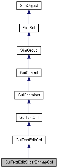
GUI Control which displays a numerical value which can be increased or decreased using a pair of bitmap up/down buttons. More...

Public Attributes | |
| filename | bitmap |
| Unused. | |
| bool | focusOnMouseWheel |
| If true, the control will accept giving focus to the user when the mouse wheel is used. | |
| string | format |
| Character format type to place in the control. | |
| float | increment |
| How far to increment the slider on each step. | |
| Point2F | range |
| Maximum vertical and horizontal range to allow in the control. | |
GUI Control which displays a numerical value which can be increased or decreased using a pair of bitmap up/down buttons.
This control uses the bitmap specified in it's profile (GuiControlProfile::bitmapName). It takes this image and breaks up aspects of it to render the up and down arrows. It is also important to set GuiControlProfile::hasBitmapArray to true on the profile as well.
The bitmap referenced should be broken up into a 1 x 4 grid (using the top left color pixel as a border color between each of the images) in which it will map to the following places:
1
2
3
4
singleton GuiControlProfile (SliderBitmapGUIProfile)
{
   bitmap = "core/art/gui/images/sliderArray";
   hasBitmapArray = true;
   opaque = false;
};

new GuiTextEditSliderBitmapCtrl()
{
   profile = "SliderBitmapGUIProfile";
   format = "%3.2f";
   range = "-1e+03 1e+03";
   increment = "0.1";
   focusOnMouseWheel = "0";
   bitmap = "";
   //Properties not specific to this control have been omitted from this example.
};
| filename GuiTextEditSliderBitmapCtrl::bitmap |
Unused.
If true, the control will accept giving focus to the user when the mouse wheel is used.
Character format type to place in the control.
How far to increment the slider on each step.
Maximum vertical and horizontal range to allow in the control.